Side Bar Navigation
The SideBar component offers a clean and responsive navigation panel for your web applications and dashboards.
Designed with Tailwind CSS for Next.js and React.js projects, it supports flexible placement on the left or right side.
Perfect for apps with multiple sections, it helps users navigate complex layouts with ease and consistency.
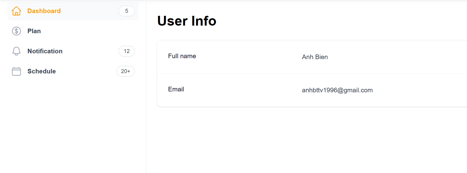
SideBar preview
Please install everything that's required
Before setup and using this component, please install all the required dependencies from this link (if you have never installed).
1. Setup codes
Create a new file components/layouts/common/SideBar.tsx
jsx"use client";

import Link from "next/link";
import { usePathname } from "next/navigation";

import { BellIcon, CalendarIcon, CurrencyDollarIcon, HomeIcon } from "@heroicons/react/24/outline";

import { ROUTES } from "@/constants/routes";
import { cn } from "@/utils/cn";

const navigation = [
  { name: "Dashboard", href: ROUTES.account, icon: HomeIcon, count: "5" },
  { name: "Plan", href: ROUTES.plan, icon: CurrencyDollarIcon },
  { name: "Notification", href: ROUTES.notification, icon: BellIcon, count: "12" },
  { name: "Schedule", href: ROUTES.schedule, icon: CalendarIcon, count: "20+" },
];

const SideBar = () => {
  const pathname = usePathname();

  return (
    <div className="sticky flex grow flex-col gap-y-5 overflow-y-auto border-r border-gray-200 bg-white px-6">
      <nav className="flex flex-1 flex-col">
        <ul role="list" className="flex flex-1 flex-col gap-y-7">
          <li>
            <ul role="list" className="-mx-2 space-y-1">
              {navigation.map((item) => (
                <li key={item.name}>
                  <Link
                    href={item.href}
                    className={cn(
                      pathname === item.href
                        ? "bg-gray-50 text-primary"
                        : "text-gray-700 hover:bg-gray-50",
                      "group flex gap-x-3 rounded-md p-2 text-sm/6 font-semibold",
                    )}
                  >
                    <item.icon
                      aria-hidden="true"
                      className={cn(
                        pathname === item.href ? "text-primary" : "text-gray-400",
                        "size-6 shrink-0",
                      )}
                    />
                    {item.name}
                    {item.count ? (
                      <span
                        aria-hidden="true"
                        className="ml-auto w-9 min-w-max whitespace-nowrap rounded-full bg-white px-2.5 py-0.5 text-center text-xs/5 font-medium text-gray-600 ring-1 ring-inset ring-gray-200"
                      >
                        {item.count}
                      </span>
                    ) : null}
                  </Link>
                </li>
              ))}
            </ul>
          </li>
        </ul>
      </nav>
    </div>
  );
};

export default SideBar;
Create a file constants/routes.ts to store the constant values.
jsexport const ROUTES = {
  homePage: "/",
  signIn: "/signin",
  signUp: "/signup",
  aboutMe: "/about-me",
  contactMe: "/contact-me",
  myProjects: "/projects",
  account: "/account",
  plan: "/account/plan",
  notification: "/account/notification",
  schedule: "/account/schedule",
};
You can change this file base on your purpose.
2. Usages
Now you can use the SideBar component for your layout components (place it on the left or right side on your page)
jsximport React, { ReactNode } from "react";

import SideBar from "./common/SideBar";

type SideBarLayoutProps = {
  children: ReactNode;
};

const SideBarLayout = ({ children }: SideBarLayoutProps) => {
  return (
    <div className="grid h-screen grid-cols-[1fr_3fr] pt-[70px]">
      <SideBar />
      {children}
    </div>
  );
};

export default SideBarLayout;
The UI like that